Stencil is a compiler that generates Web Components developed by the Ionic team. Stencil combines the best concepts of the most popular frameworks into a simple build-time tool.
Stencil takes popular features such as the Virtual DOM, Typescript and JSX to create standard-based Web components which can be used with every popular frontend framework out of the box (Angular, React, Vue).
The main goal of this article is to give a quick overview of the Stencil framework and how to use it to build Web components. We will also look at how we can build our component, so it can be used in the most popular frontend frameworks (Angular, React, Vue, Ember).
So, without wasting any further time, let’s get started.
Table of contents
Open Table of contents
Setup
Before we can start creating a component we first need to set up our stencil development environment. For that, you need to have Node js installed and then need to clone the starter project.
git clone https://github.com/ionic-team/stencil-component-starter stencil-starter
cd stencil-starter
git remote rm origin
npm install
These commands clone the stencil-component-starter project and save it in the local storage. After that, we just move into the folder and install all the dependencies of the project.
The starter project provides a standard Node js development environment including some basic configurations, a development server and some example components.
Now that we have completed the basic stencil setup we can start creating our first component.
Creating a component
Stencil components are built using JSX and Typescript. Therefore, you should be very familiar with these two technologies before going further. You can get started in Typescript using this crash course and JSX using this great guide by Flavio Copes.
To create our component we first need to create a new directory in src/component and then create the two needed files.
cd src/components
mkdir sample-component && cd sample-component
touch sample-component.tsx && touch sample-component.css
The css file will remain blank for the moment. The .tsx file will contain following code:
import { Component, h } from '@stencil/core';

@Component({
 tag: 'sample-component',
 styleUrl: 'sample-component.css',
 shadow: true
})
export class SampleComponent{
 render() {
  return (
   <div>
   <h1>Sample Component</h1>
   </div>
  );
 }
}
Now let’s walk through the bit of code we just wrote:
- In order to define a Stencil component we need to decorate our classes with the
@Componentdeclarator previously imported fromstencil/core. This declarator allows us to define some basic information about our component like the tag that will later be used to call our component (In this case<sample-component></sample-component>). Next up we defined thestyleUrlproperty which enables the css design and points to the css file we previously created. - The
render()function describes the appearance of our component using JSX syntax. In this example, it consists of a div with a h1 tag insight.
Testing a component
Now that we have defined our first component let’s take a look at how we can test our component by using it in our index.html. For that we just remove the standard component and import our own one.
<!DOCTYPE html>
<html dir="ltr" lang="en">
  <head>
    <meta charset="utf-8" />
    <meta name="viewport" content="width=device-width, initial-scale=1.0, minimum-scale=1.0, maximum-scale=5.0" />
    <title>Stencil Component Starter</title>

    <script type="module" src="/build/stencil-starter-project-name.esm.js"></script>
    <script nomodule src="/build/stencil-starter-project-name.js"></script>
  </head>
  <body>
    <sample-component></sample-component>
  </body>
</html>
Here we imported our component by including the sample-component.js script and then use it by adding the tag of our component. After that we can start our development server using the npm run start command.
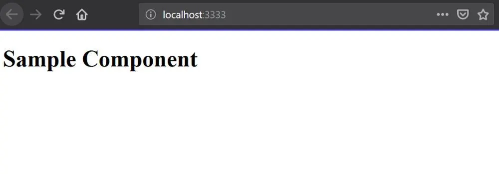
Now you should see the rendering of our basic component on localhost:3333.
Properties
Properties are dynamic parameters that are used to pass down data from parent components to any of their child components. Properties are declared using the @Prop declarator. They can have many different types including number, boolean, string, Object or an Array.
Defining properties
Let’s change our sample component to make it a little bit more dynamic.
import { Component, h, Prop } from '@stencil/core';
@Component({
 tag: 'sample-component',
 styleUrl: 'sample-component.css',
 shadow: true
})
export class SampleComponent{
 @Prop() text: string = 'World'

 render() {
  return (
   <div>
    <h1>Hello {this.text}</h1>
   </div>
  );
 }
}
Here we first import the @Prop() declarator and the use it to define a string parameter with a default value. Then we use the parameter that is passed down in our render() function using databinding.
Using Properties
Now that we have defined the property in our component let’s look at how we can use it in our markup language.
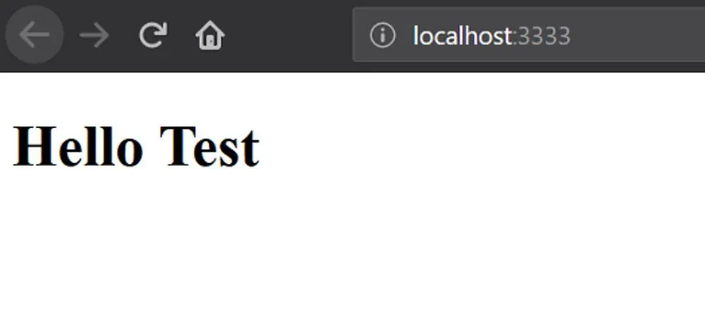
<sample-component text="Test"></sample-component>By defining the property in the markup we map the value to the text attribute and are able to use it in our component.
When we visit the website now we should see the dynamic parameter being displayed.
Properties can also be accessed via Javascript from the element.
const sampleComponent = document.querySelector('sample-component');
const test = sampleComponent.text
Property mutability
Properties are immutable from inside the component logic by default. Once a value is set by the user it can’t be updated internally. However, it’s possible to manually allow a Property to be mutable from inside the component by declaring it mutable.
@Prop({ mutable: true }) name: string = 'Name';States
The @State declarator is used to manage internal data for a component. This means that users can not modify the data but the component can change it as he sees fit.
@State() isActive = false
updateStatement() {
 this.isActive = !this.isActive
}
State should only be used if the component needs to re-render when the data is changed. If that’s not the case it’s a good practice to avoid the @State declarator and use normal internal states instead.
internalState: boolean = trueEvents
Events in Stencil are used to emit data and events from our component. The @Event() declarator is used to define custom DOM events.
Creating a DOM event
@Event() active: EventEmitter;
checkboxCompletedHandler(checkbox: Checkbox) {
 this.active.emit(checkbox);
}
The code above will dispatch a custom DOM event called active.
Listening to the event
Now that we have defined our first custom DOM event let’s take a look at how we can setup a listener which gets called when the events is emitted.
import { Listen } from '@stencil/core';
@Listen('active')
activeStateHandler(event: CustomEvent) {
 console.log('Received the custom active event: ', event.detail);
}
The @Listen() declarator can also be used to listen to normal DOM events like onClick or keyDown.
@Listen('click', { capture: true })
handleClick(ev) {
 console.log('click');
}
Defining events in JSX
We can also bind listeners to events directly in our JSX code. This works similar to normal DOM events.
<sample-component text="Test" active={ev => this.someMethod(ev)}></sample-component>You can also define normal DOM events like you can in normal HTML.
<input onChange={(event: UIEvent) => this.inputChanged(event)}/>Here we define an onChange event listener and call the inputChanged function when the event is triggered.
Methods
The @Method() declarator is used to expose methods to the public API. All methods decorated with the @Method() can be called directly from the element, i.e. they are intended to be callable from the outside.
Defining Methods
Stencils architecture is async at all levels which means that public functions have to be defined async as well even if they don’t return a promise. They also need to be declared with the @Method() declarator to make them publicly accessible.
import { Method } from '@stencil/core';

@Method()
async getState() {
 // Get the state of the item
}
Private methods on the other hand don’t have to be async and do not have the @Method() declarator.
getState() {
 return this.isActive
}
Calling Methods
Public methods can be called by getting the element from the DOM and calling the method on the reference. Here is an example:
const component = document.querySelector('sample-component')
const state = component.getState()
Note: Methods are not immediately available on a component they have to be loaded/hydrated by Stencil before you can use them.
Elements
The @Element declarator enables us to get a reference of the components host element. This can be helpful if you want to manipulate the host during runtime.
Now let’s look at an example use case of the @Element declarator:
@Element() messageDiv: HTMLElement;
showMessage() {
 this.messageDiv.style.display = 'block';
};
In this example we get the host component using the @Element() declarator and then change its style in a private function.
Lifecycle
Stencil component have numerous lifecycle methods which can be used to know which state the component is in e.g load or unload. They can be added to your components to hook methods to the right time events.
Here is a list of the most important lifecycle events in Stencil:
componentWillLoad()— Before renderingcomponentDidLoad()— After renderingcomponentWillUpdate()— Before updatingcomponentDidUpdate()— After updatingcomponentDidUnload()— After unmounting
Now let’s look at an example implementation of a lifecycle method.
componentDidLoad() {
 console.log('Component successfully loaded')
 // Do something
}
Here we define the componentDidLoad() lifecycle function which will be called right after the component was fully loaded and the first render occurred.
If you want a full list of all the available lifecycle events you can visit the official documentation.
Nesting
Stencil also provides the functionality to nest components in each other by adding the HTML tag to the JSX code. Since the components are just plain HTML nothing needs to be imported to use them in another component.
Here is a simple example of using a component within another component:
Child Component:
import { Component, Prop, h } from '@stencil/core';

@Component({
 tag: 'embedded-component'
})
export class SampleComponent{
 @Prop() text: string = 'World'

 render() {
  return (
   <div>
    <h1>Hello {this.text}</h1>
   </div>
  );
 }
}
Parent component:
import { Component, h } from '@stencil/core';

@Component({
 tag: 'parent-component'
})
export class MyParentComponent {
 render() {
  return (
   <div>
    <embedded-component text="Hello Stencil"></embedded-component>
   </div>
  );
 }
}
In this example the parent component includes a reference to the <embedded-component> in the render function.
Unit testing
Now that we know how to define and use components let’s look at how we can test them using Jest as our Test runner and assertion library (Jest is the default testing framework for Stencil).
Instantiation our component
In Unit Testing you normally instantiate your component before a test. This is normally done by importing the component you want to test and instantiating it manually. This is not necessary in Stencil because the components are plain Javascript. This gives us the ability to instantiate them using the new keyword.
import {SampleComponent} from './sample-component'

describe('sample-component', () => {
     it('builds', () => {
      const sampleComponent = new SampleComponent
      expect(sampleComponent).toBeTruthy();
    });
})
In this example we instantiated our component using the new keyword and then checked if it build successfully using the toBeTruthy() function provided by Jest.
Most of the time we will need to instantiate the component before every test. That can be done using the beforeEach() function which is also provided by Jest.
let sampleComponent;
beforeEach(() => {
 sampleComponent = new SampleComponent();
});
Now that we have an instance of our component you can start testing it using the Jest framework. Here are some guides if you are not sure where to start:
Preparing for Production
Now that we have a fully functional component let’s prepare it for a production build. For that we just need to complete the following steps:
Name changes
First of all, we need to update the names in our project in the stencil.config.ts and package.json files.
We can do so by adding the namespace parameter in the stencil.config.ts and changing the name parameter in package.json.
// stencil.config.ts
export const config: Config = {
 namespace: 'sample-component',
 ...
};
// package.json
"name": "sample-component",Picking an output target
Stencil functions as a compiler which means that it can generate different kinds of builds depending on how the component will be used. Let’s look at the different targets that are available.
dist— For distributionwww— Websitesdocs-readme— Documentation readme files formatted in markdowndocs-json— Documentation data formatted in JSON
Now that we know the different kinds of output targets let’s look at an example configuration in our stencil.config.js file.
export const config: Config = {
  outputTargets: [
    {
      type: 'dist'
    },
    {
      type: 'www'
    }
  ]
};
Building the project
Now that we have completed the preparations for production let’s continue by building our project using the npm run build command.
After a few seconds you should see a dist folder in the project with the following folders and files:
sample-component.js— The entry point to the componentsample-component— Contains the compiled code of our componenttypes— Contains the Typescript types and is useful when using the component in Typescript projectscollection— Allows to share components more effectively
These folders are used for different types of production scenarios. The minimal code required to use the component with HTML and vanilla Javascript consists of the sample-component.js file and the sample-component folder.
For a detailed overview of how you can use your component in vanilla javascript and popular web framework you can look at the official documentation.
Conclusion
You made it all the way until the end! Hope that this article helped you understand the basics of Stenciljs and why it is so useful.
If you have found this useful, please consider recommending and sharing it with other fellow developers.
If you have any questions or feedback, let me know in the comments down below.